

Peter Pan Redesign
This case study tackles the accessibility challenges of the Peter Pan Bus website—an essential travel tool for students, tourists, and commuters across the Northeast. By focusing on non-native speakers and users with cognitive disabilities, the redesign addresses language barriers, dense information layouts, and complex navigation. The goal: a clearer, more intuitive, and more inclusive booking experience for everyone.
-
Tools
Figma, Figjam
-
Role
UX Designer & Researcher
-
Timeline
September 2025 - December 2025
Goal
The goal of this project was to redesign the Peter Pan Bus Lines website to make it clearer, easier to navigate, and more inclusive. By focusing on accessibility and user-centered design, the redesign aims to help all travelers plan and book trips more efficiently and confidently.
Problem
Peter Pan Bus Lines is a popular intercity service in the Northeastern U.S., used by students, commuters, and travelers.
While the service itself is widely used, the website can be difficult to navigate, which creates challenges for certain users.
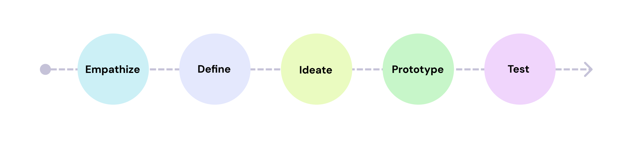
Design Process
Empathize
Research goals:
For this project, We selected users with cognitive disabilities and non-native English speakers as our primary focus. We want to investigate how they navigate the Peter Pan Bus Lines website, so we can identify their biggest challenges and design a more accessible, intuitive experience.Methodologies:
User Interviews
Task Analysis
Competitive analysis
Literature review
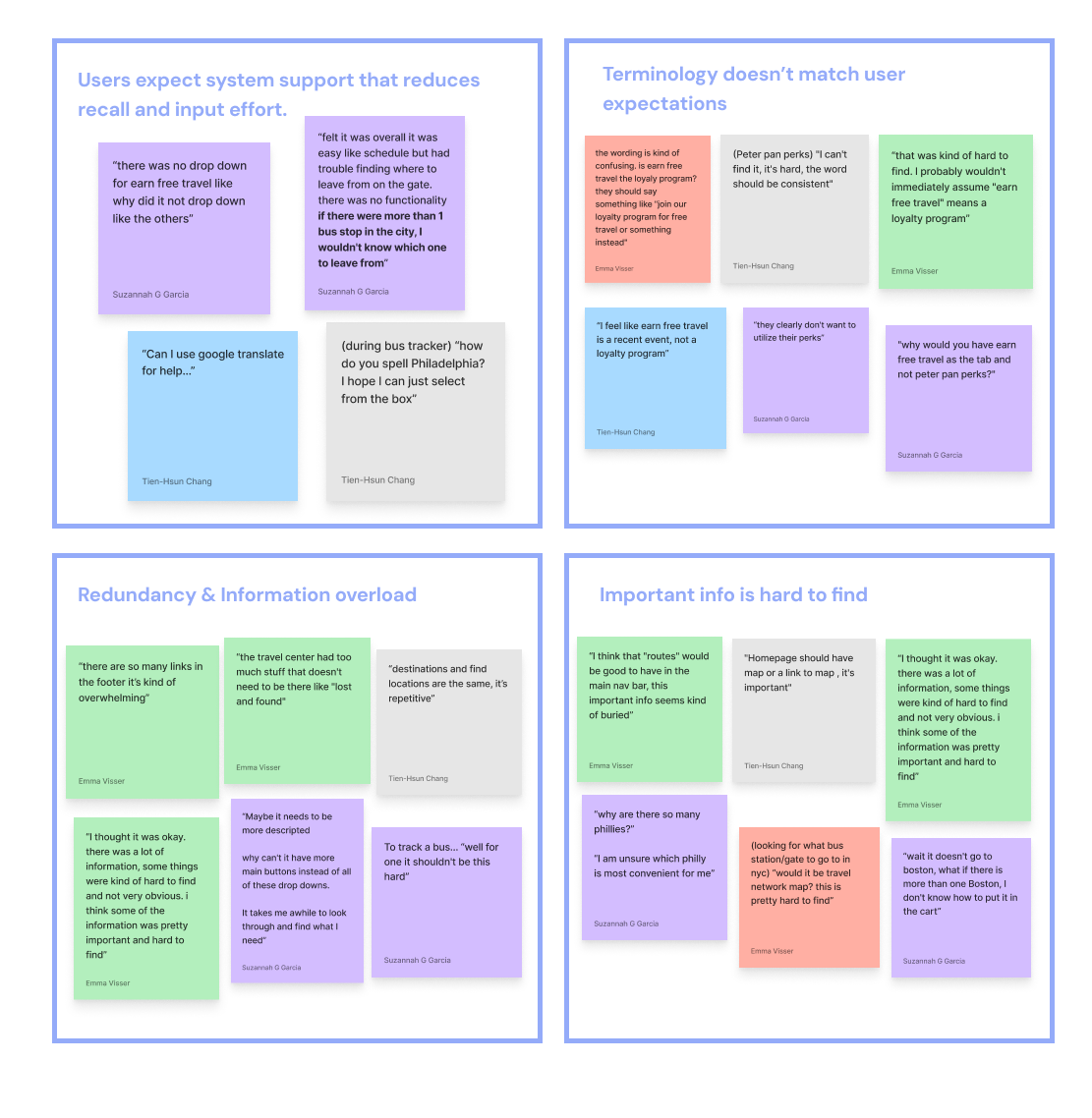
User Research
We conducted 6 usability interviews with non-native speakers and users with cognitive disabilities.
Participants completed 5 key tasks on the Peter Pan website using a think-aloud approach.
We collected feedback on confusion or frustration points, cognitive load and task difficulty, Navigation, language clarity, and information density
Key Findings:
Users expect system support
Terminology doesn’t match user expectations
Redundancy & Info overload
Important info is hard to find
Literature Review
We reviewed academic literature on cognitive accessibility and multilingual users.
Key takeaways:
Simplify language and instructions
Use scannable layouts and clear visual cues
Provide translation and accessibility support
Define

Ideate
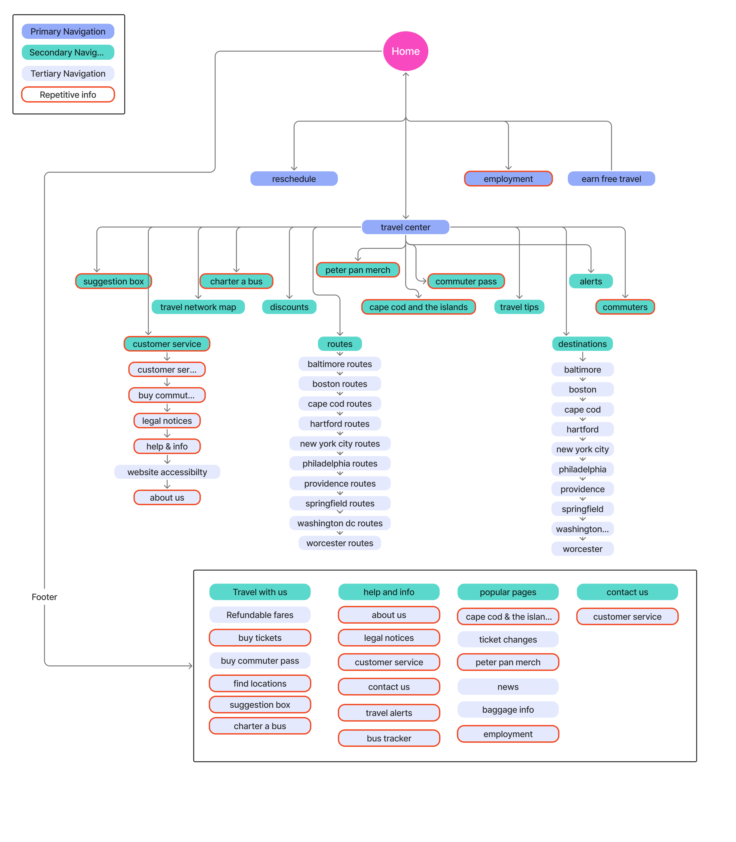
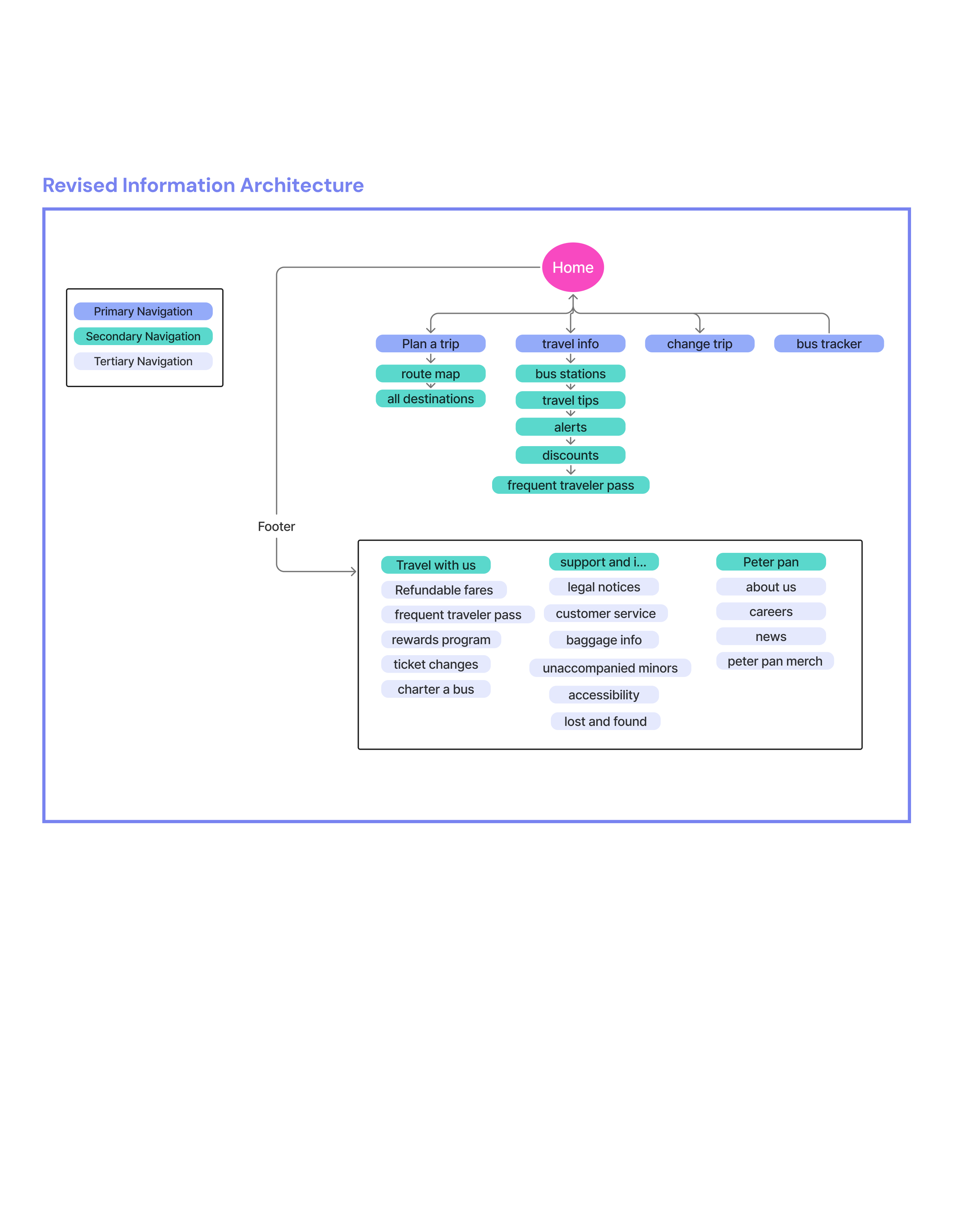
Information Architecture
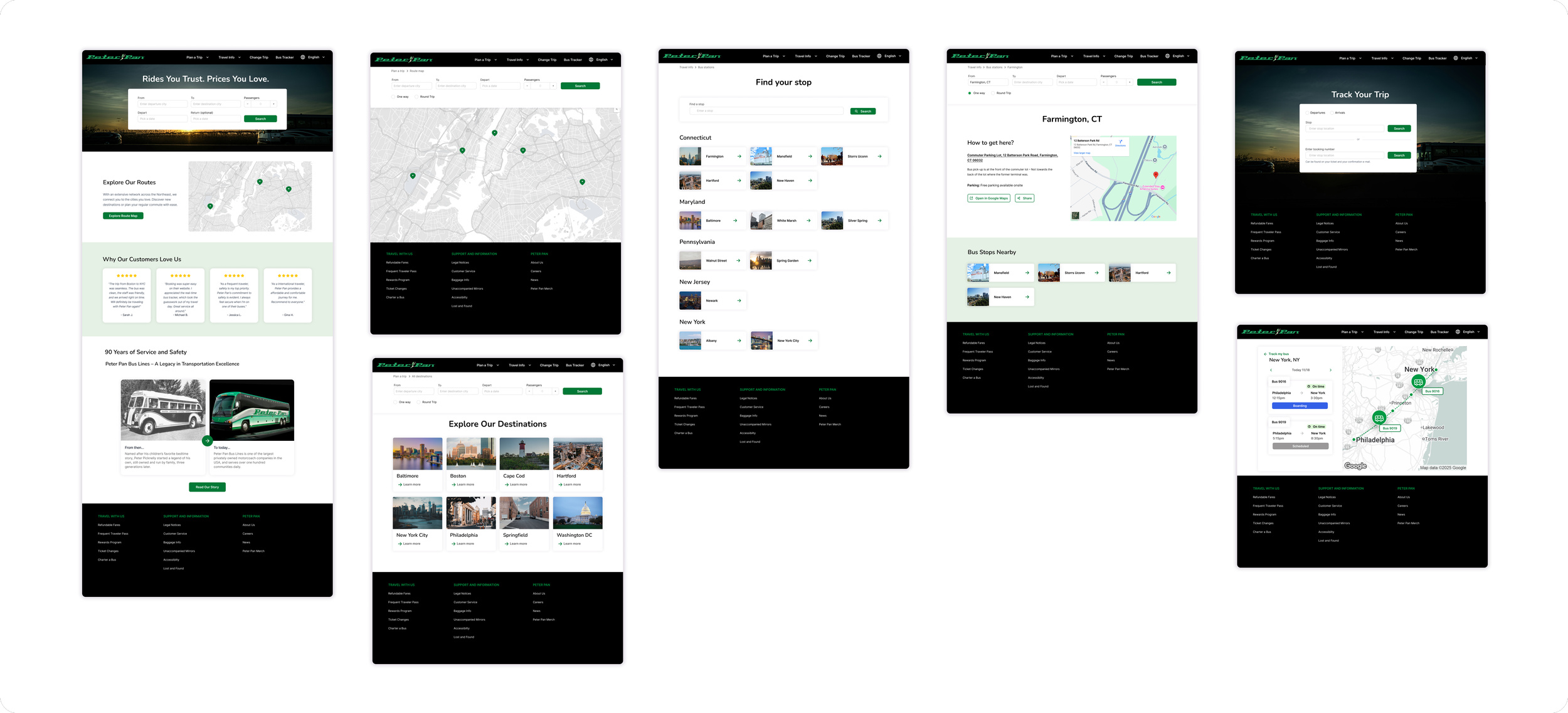
I mapped the all the key pages on the Peter Pan website, uncovering overlapping buttons, redundant content, and confusing navigation paths. This analysis guided the creation of a clearer, more organized site structure. The redesigned navigation preserves all existing content while establishing a stronger hierarchy and reducing repetition, making it easier for users to find information.
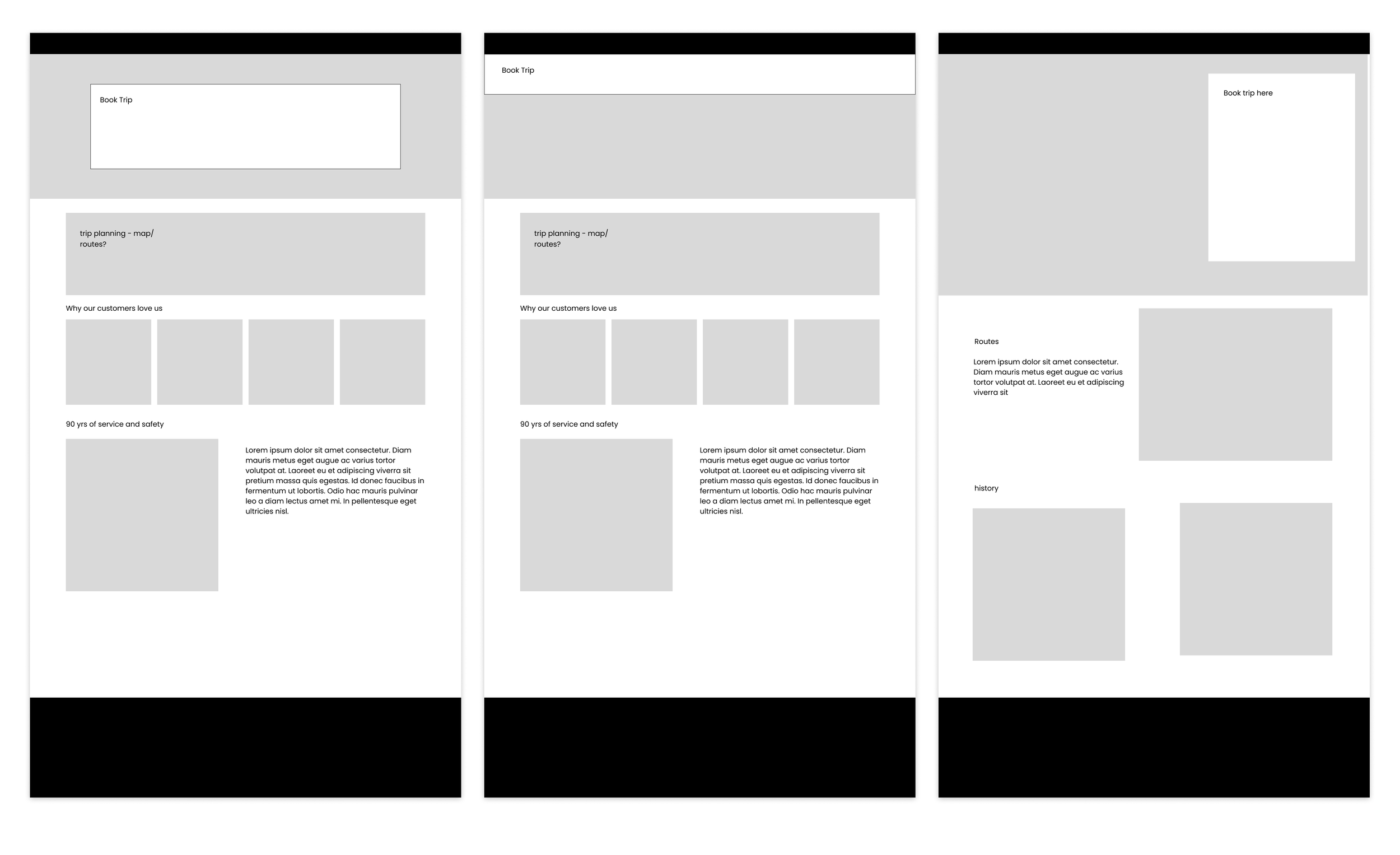
Wireframes
With the new information architecture in place, I began developing low-fidelity wireframes for key pages, using them to explore layout, hierarchy, and navigation patterns before moving into higher fidelity designs.
Prototype
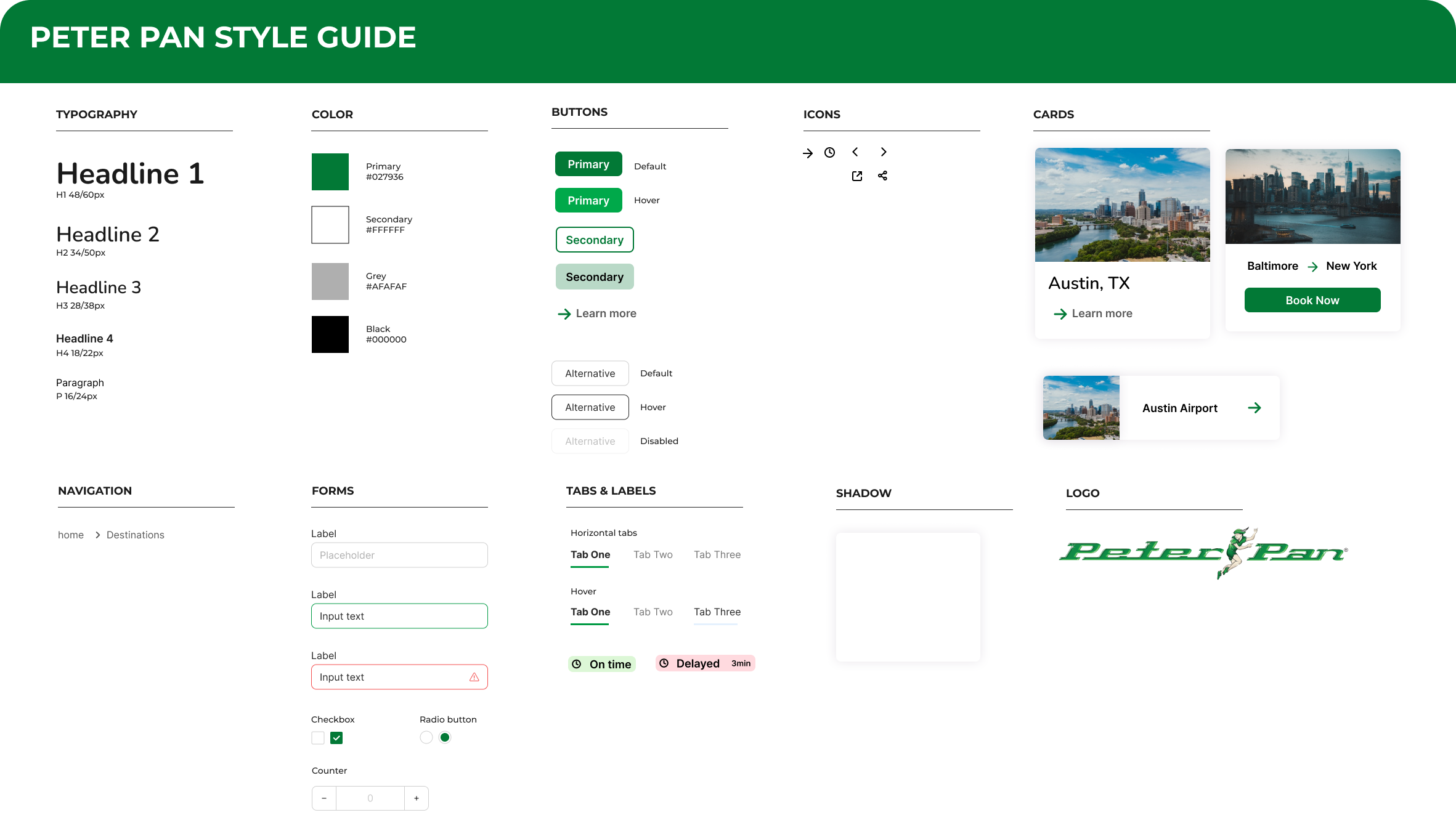
UI Library Components
For the UI components, we maintained the brand’s existing color palette and typography to keep familiarity, while slightly darkening the colors to meet accessibility contrast guidelines.
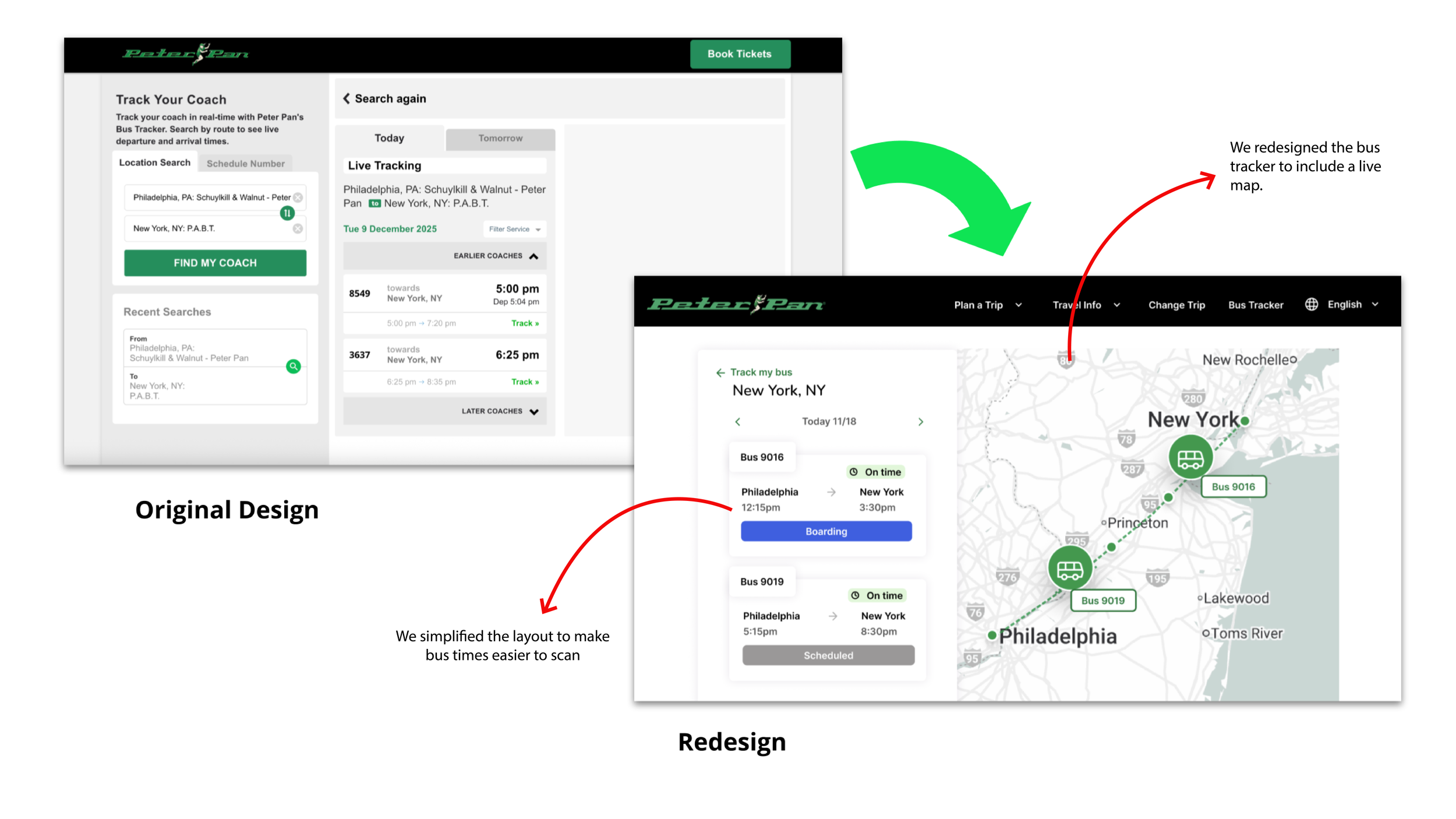
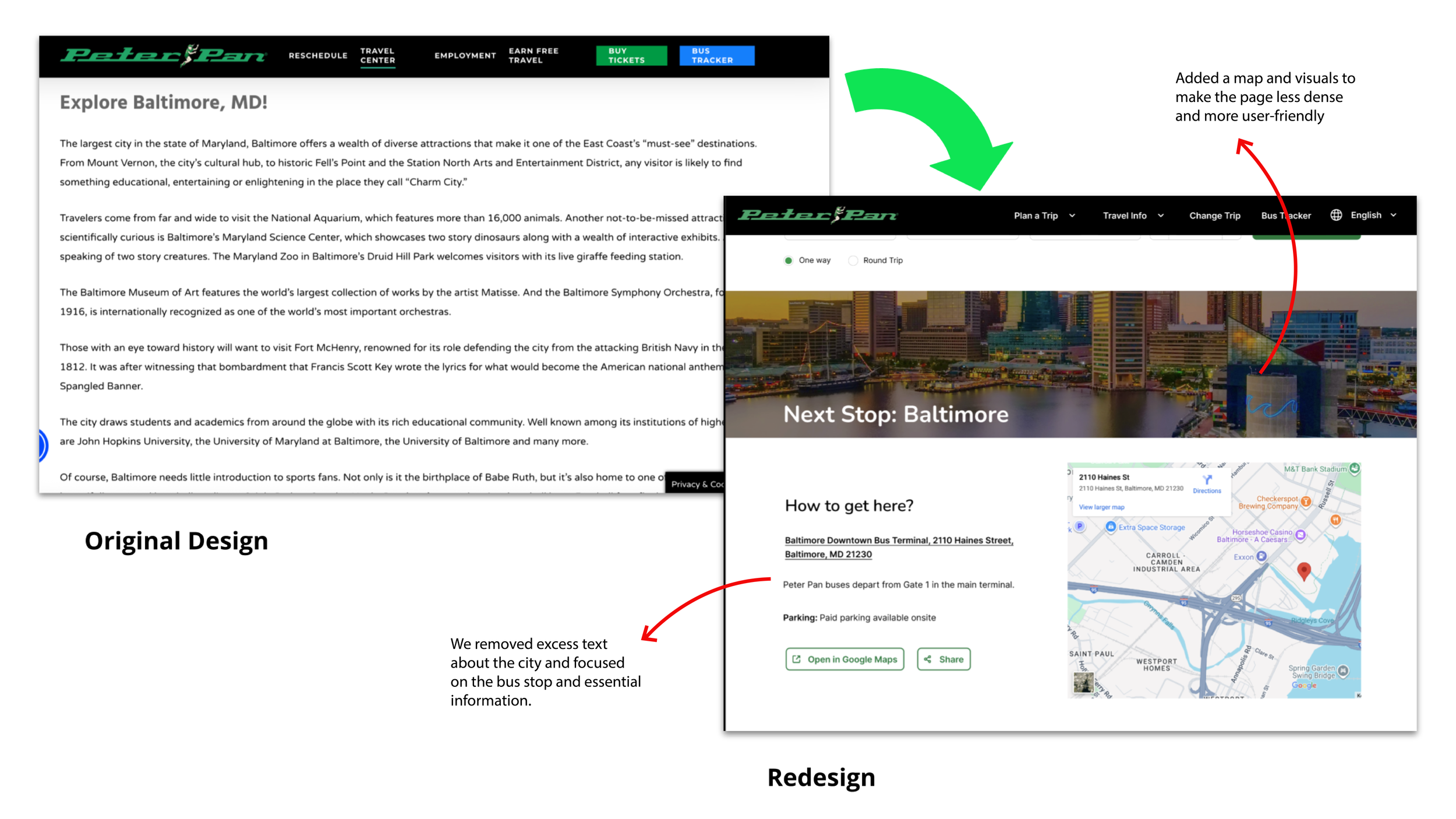
To improve scannability and visual hierarchy, we introduced icons and card-based components, which were previously absent, creating clearer groupings and more intuitive interactions.
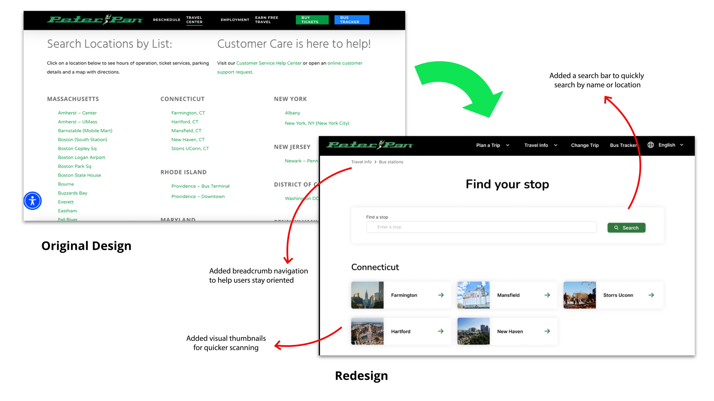
Check out our Key changes…

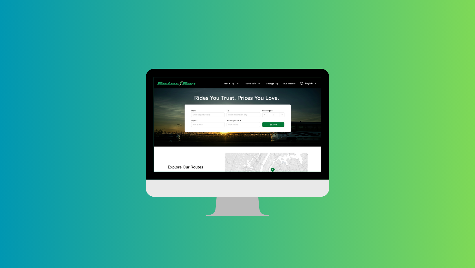
Final design
Conclusion & Final Thoughts
Key Takeaways
I came out of this project with three main takeaways:
Real users are essential.
What we think people need often differs from what they actually struggle with. Speaking directly to users revealed issues we would not have identified on our own.A larger participant pool strengthens insights.
More diverse perspectives would help validate patterns, challenge assumptions, and uncover needs we might otherwise overlook.Inclusive design must be built in, not added on.
Approaching this project through an inclusive design lens pushed us beyond standard HCI or usability work. It reinforced that accessibility isn’t optional or “extra.” “Inclusive design is not extra work; it’s part of the work.”
If we had more time…
Our next steps would include:
Extend the Design Across the Full Website instead of just key pages.
Conducting usability tests and iterating on the prototype based on real feedback.
Running an inclusive heuristic evaluation using Universal Design principles and WCAG cognitive guidelines.
Testing with a larger and more diverse user group to deepen and validate our insights.