

Venus
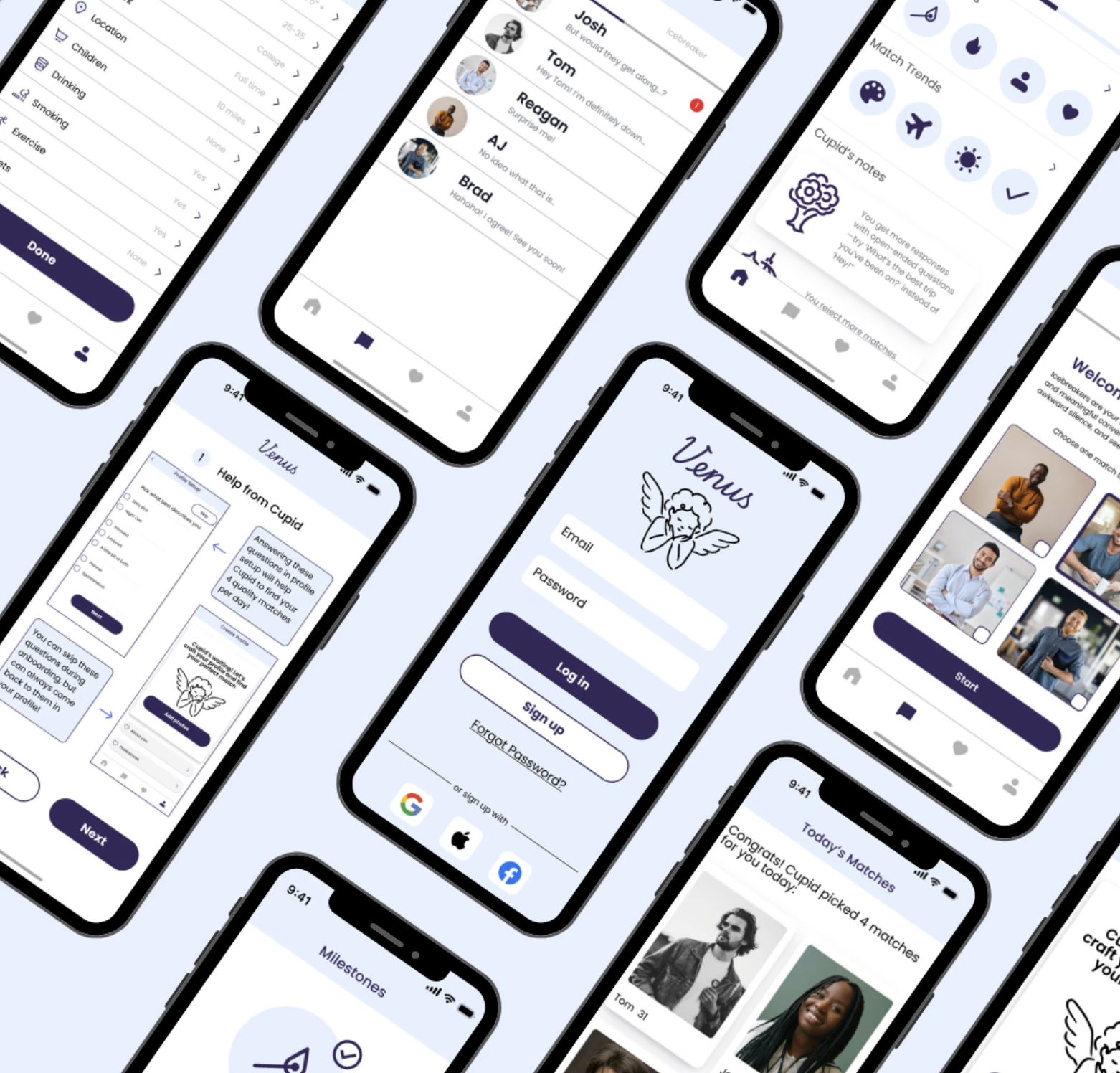
This end-to-end project introduces Venus, a reimagined dating app that reduces decision fatigue and encourages meaningful connections. Instead of endless swiping, Venus offers four curated matches per day—prioritizing quality over quantity.
Users are guided by Cupid, an AI assistant that provides conversation tips, positive reinforcement, and learns from user feedback to improve future matches.
With Venus, dating becomes more intentional, supportive, and aligned with what users truly seek.
Tools
Figma, Figjam
Role
UX Designer & Researcher
Timeline
January 2025-April 2025
Goal
This project aims to create a dating app experience that reduces decision fatigue and encourages meaningful, intentional connections. By limiting daily matches and offering AI-powered support, Venus aims to guide users toward deeper conversations and more compatible relationships—transforming dating from a frustrating experience into a supportive and thoughtful journey.
Problem
Modern dating apps often prioritize quantity over quality, turning the search for connection into a game of superficial swiping. This abundance of choice leads to decision fatigue and shallow interactions, leaving users—especially those seeking meaningful relationships—frustrated and disillusioned. As a result, many abandon these platforms altogether.
User Research
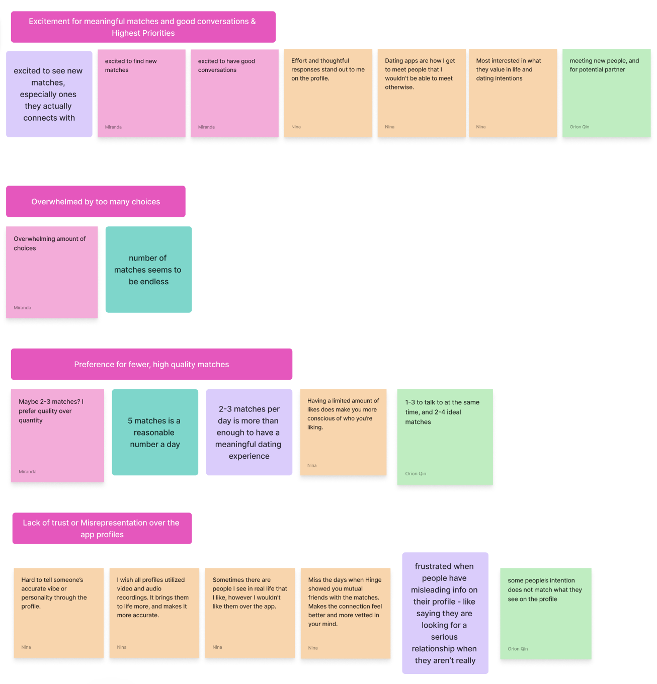
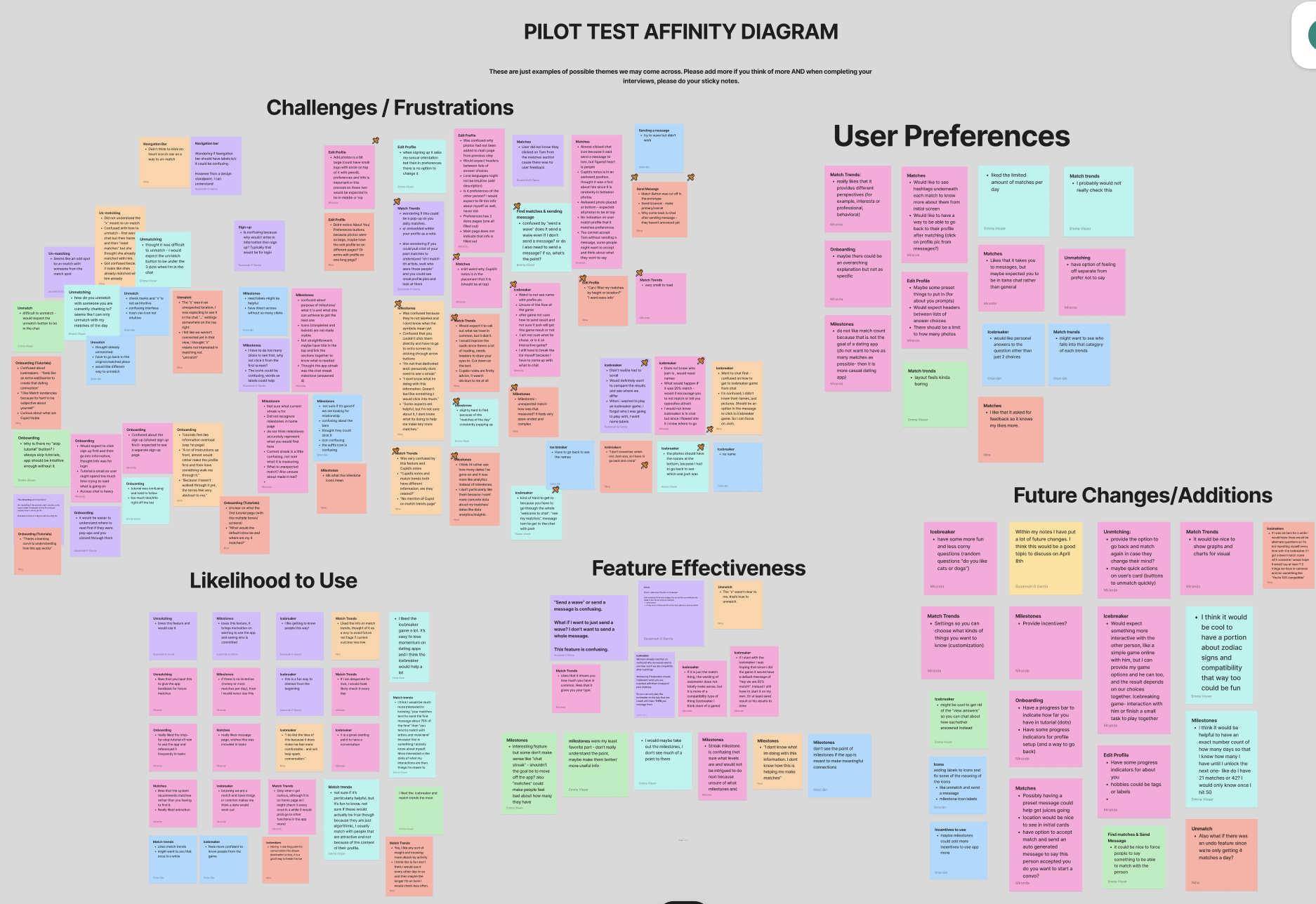
We interviewed five dating app users (ages 24–33) to explore common pain points. We then created an affinity diagram. Some key themes included overwhelm from too many choices, a desire for meaningful matches, and frustration with low-effort or misleading profiles. One user shared, “It can feel overwhelming—so many choices and repetitive swiping,” while another said, “It feels like you’re putting puzzle pieces together when profiles lack effort.”
We combined these insights with a competitive analysis of Hinge, Tinder, and Bumble to identify gaps and opportunities—shaping Venus into a more focused, supportive dating experience.
From Insights to Design
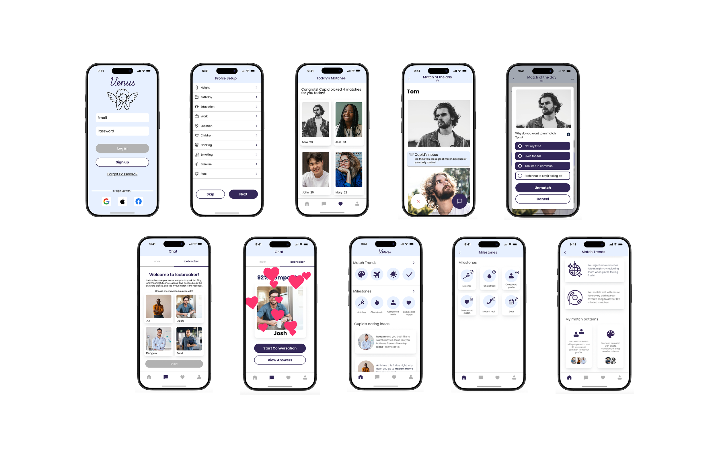
Using key themes from our affinity mapping—like choice overload, low-effort profiles, and the desire for more meaningful connections—we translated user needs into actionable design goals. These informed our low- and mid-fidelity prototypes, where we focused on five core user flows: onboarding, editing a profile, home, chat interaction, and match of the day.
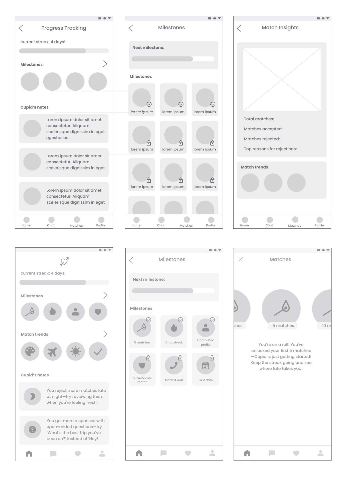
I primarily focused on the design of the home page, which offers users a more reflective, intentional experience by displaying milestones, match trends, and personalized date ideas—all designed to encourage thoughtful engagement over mindless swiping.
Evolving to High-Fidelity
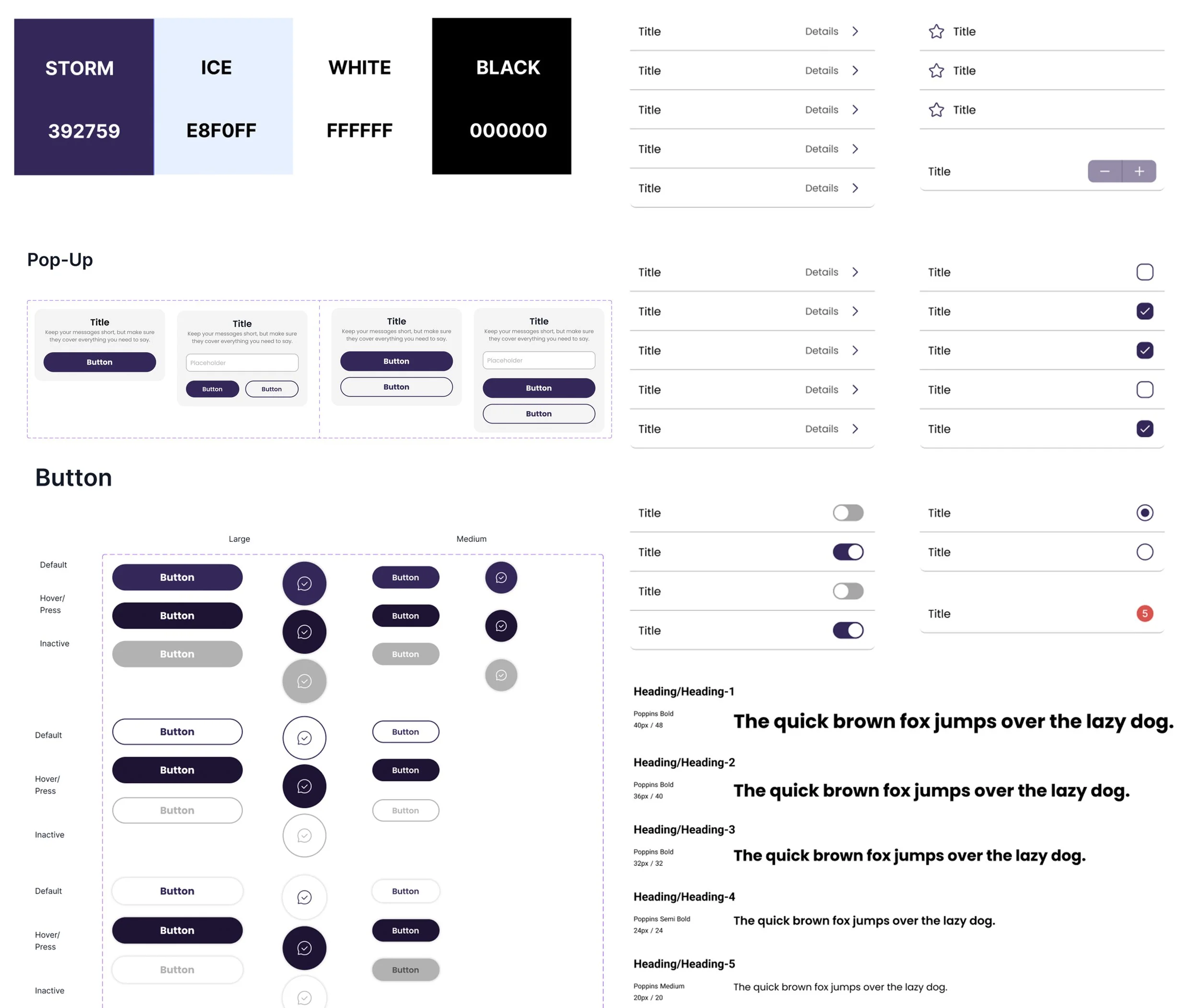
Continuing from our mid-fidelity prototype, we refined our key screens and transitioned into high fidelity by implementing a finalized design system. We established a cohesive visual language by standardizing typography, corner radii, and UI components, while introducing a polished color palette. Our primary colors—a light blue and a purplish dark blue—were chosen to evoke a sense of calm, trust, and modern romance, aligning with Venus's goal of creating a more intentional dating experience.
Usability Testing
We conducted 10 usability tests with Gen Z and Millennial participants (ages 22–34), representing diverse genders and sexualities. Our goal was to evaluate how users engaged with our high-fidelity prototype of Venus, a dating app focused on quality over quantity.
Using the think-aloud method, we observed participants as they completed tasks, capturing real-time reactions and mental models. One teammate led the session, while the other documented feedback and behavior. We also administered a custom questionnaire inspired by the System Usability Scale (SUS), combining scaled and open-ended questions to assess usability.
To analyze the findings, we created an affinity diagram to group feedback by themes, helping us identify user favorites, points of confusion, and areas for improvement.
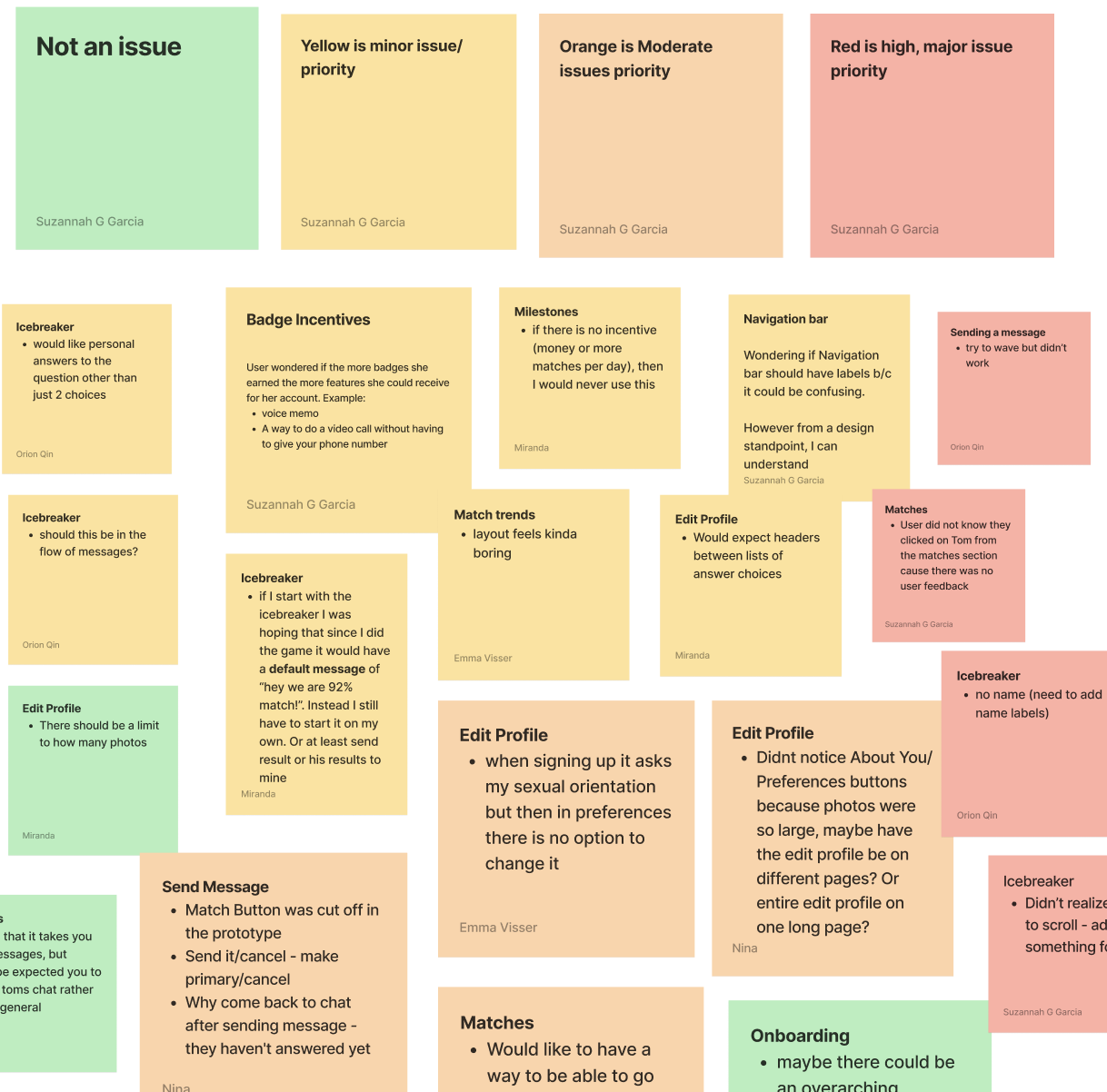
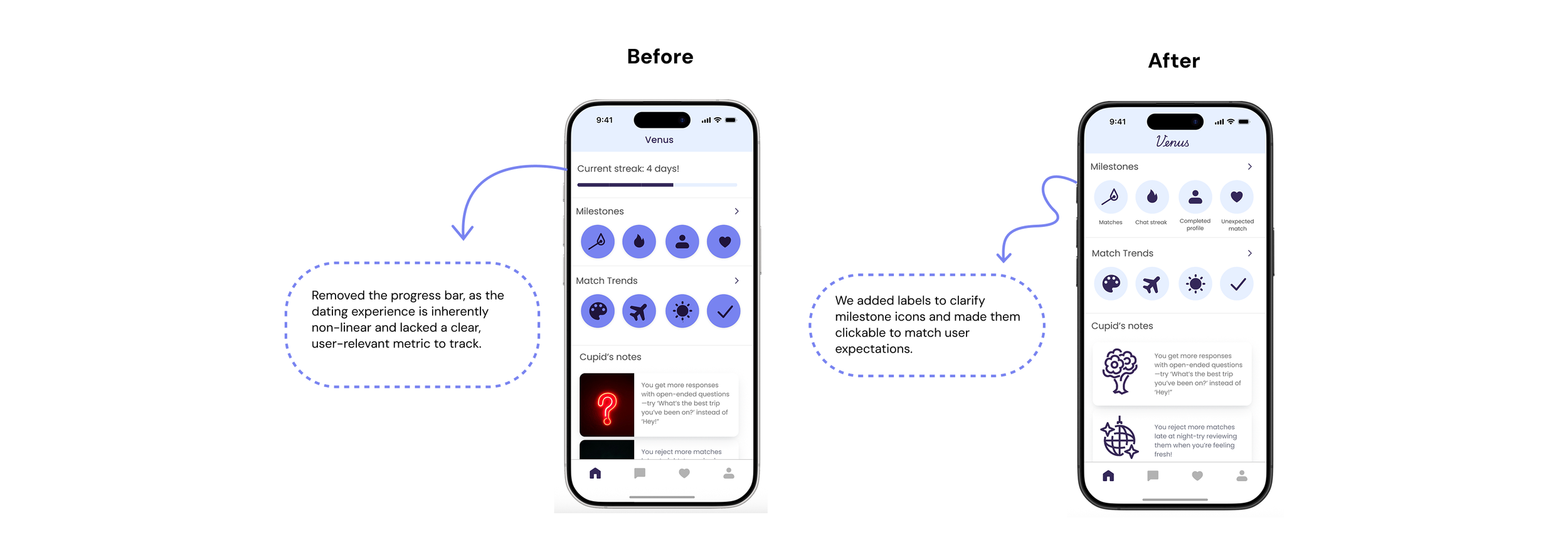
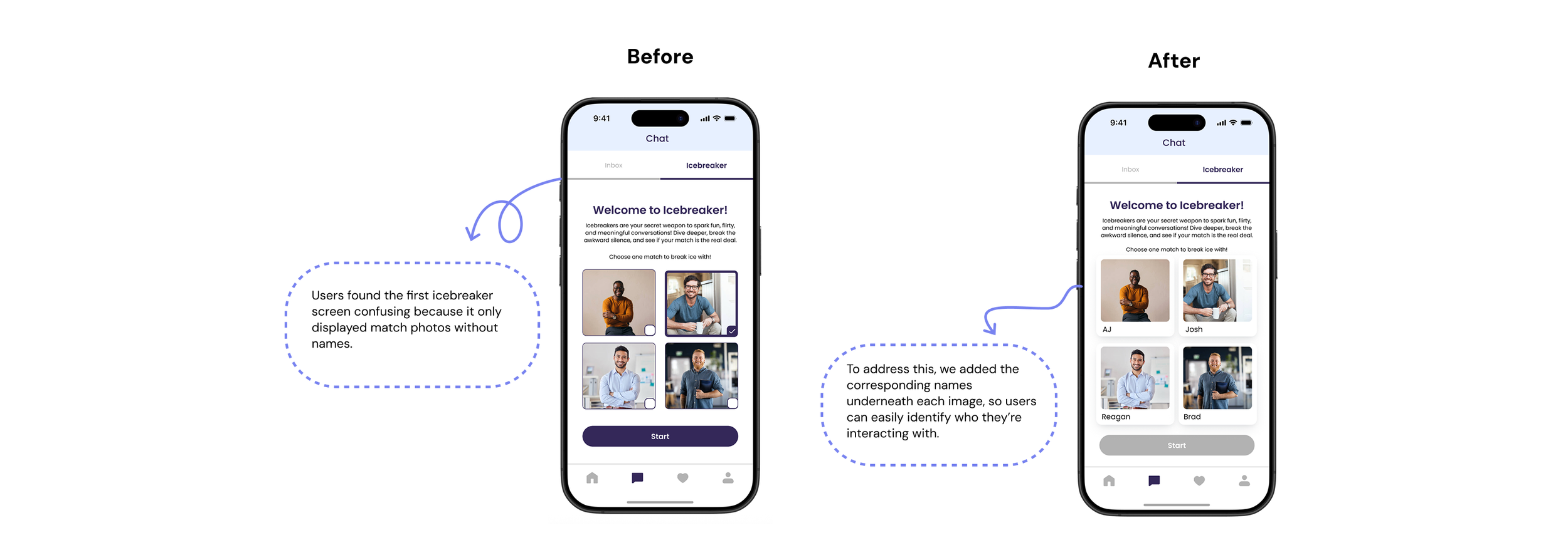
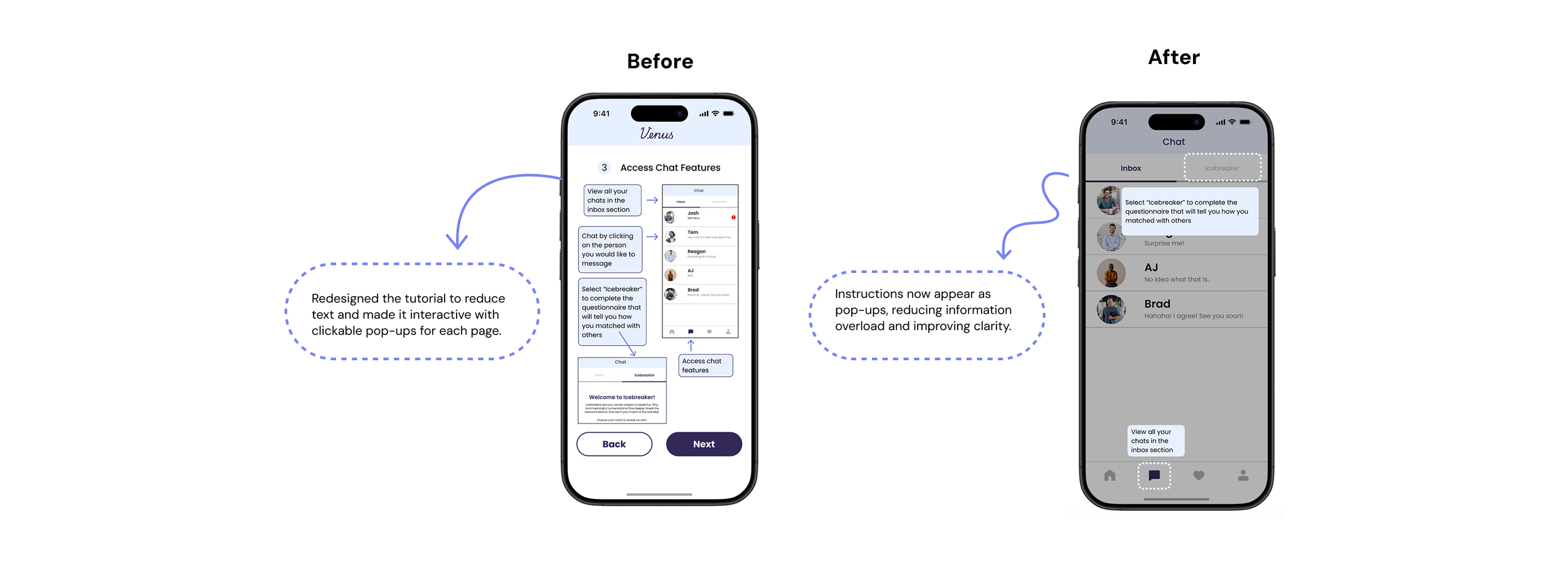
Key Changes
After usability testing, we categorized issues as Major, Moderate, Minor, or Low and prioritized changes accordingly. The screens below highlight some of our key changes.
Final Prototype
With these changes implemented, we refined our high-fidelity prototype to better reflect user needs and expectations. Here’s a quick demo of the final version of Venus.
Challenges
Time constraints – Balancing other coursework and personal responsibilities made it hard to conduct and analyze usability testing as thoroughly as we wanted.
Participant diversity – While we tried to recruit inclusively, our sample size and network limited how representative our findings were.
Key Learnings
User feedback is everything – Even features we thought were intuitive (like milestones) turned out to be confusing until we saw how users interacted with them.
Small details matter – Icon labels, button placement, and contextual names made a big difference in reducing friction and improving clarity.
Design is never final – Iterating based on usability insights helped us realize how much our original assumptions needed to evolve.